How Colors Can Make or Break Your Ad Creative: A Guide
The choice of a certain background color in an ad creative can have a sizeable impact on its performance. Here are some best practices for using colors to your advantage in ads.


Background colors play a significant role in capturing attention, evoking emotions, and influencing consumer behavior.
This comprehensive guide explores how different background colors can impact the performance of digital ads, affecting key metrics such as click-through rates (CTR), conversion rates, and overall engagement.
Understanding Color Psychology
Color psychology refers to the study of how colors influence human behavior and emotions. Different colors can evoke specific feelings and reactions, which can significantly impact the effectiveness of ad campaigns.
Here are some common associations with various colors:
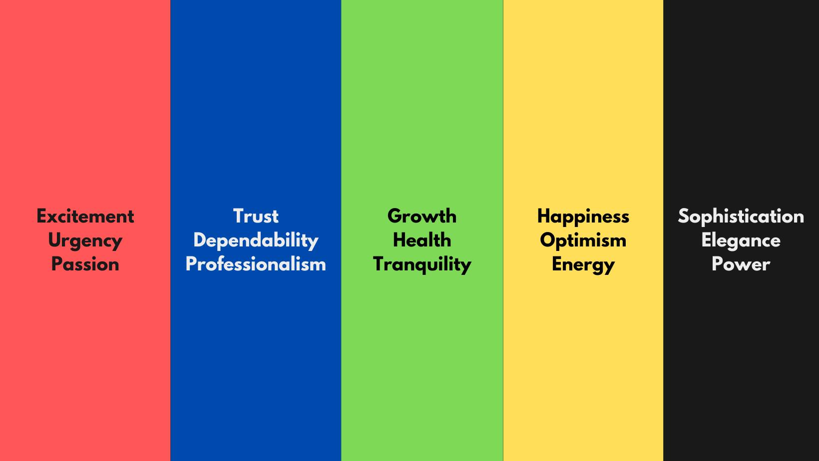
- Red: Excitement, urgency, passion. Often used in clearance sales and limited-time offers.
- Blue: Trust, dependability, professionalism. Popular with tech companies, financial institutions, and healthcare providers.
- Green: Growth, health, tranquility. Commonly used by environmental and wellness brands.
- Yellow: Happiness, optimism, energy. Effective for food and beverage ads but should be used sparingly.
- Black: Sophistication, elegance, power. Frequently used by luxury brands.
Understanding these associations helps marketers choose background colors that align with their brand message and target audience preferences.
The Impact on Key Performance Metrics
Click-Through Rates (CTR)
High Contrast:
Ads with high-contrast background colors tend to grab more attention. For example, a bright call-to-action (CTA) button on a dark background stands out more, encouraging clicks. High-contrast designs are particularly effective in crowded digital spaces where standing out is crucial. However, high contrast backgrounds should be used carefully as they can strain the eyes.
Color Harmony:
Harmonious color schemes are visually pleasing and can improve user experience, leading to higher CTR. Clashing or overly bright colors can deter viewers and lower CTR.
Case Study - VidMob:
VidMob's analysis shows that warm colors (reds and oranges) are generally more arousing and effective for creating urgency, while cool colors (blues and greens) are better for building trust and reliability. Ads with harmonious color schemes tend to perform better in terms of CTR.
Conversion Rates
Trust and Credibility:
Background colors that convey trust and professionalism, such as blue and green, can positively impact conversion rates. These colors make users feel more comfortable and secure, encouraging them to complete a purchase or sign-up.
Urgency and Excitement:
Colors like red and orange can create a sense of urgency, driving impulse actions and boosting conversion rates, especially for time-sensitive offers.
Overall Engagement
Cultural Relevance:
The effectiveness of colors can vary by culture. For instance, white may signify purity in Western cultures but can represent mourning in some Eastern cultures. Tailoring colors to cultural preferences can enhance engagement and ad performance.
Consistency:
Maintaining consistency in color schemes across different ad creatives helps reinforce brand identity and build recognition, which can lead to higher engagement over time.
Practical Applications and Examples
- VidMob's Insights:
VidMob provides a detailed analysis of the performance of ad creatives, including the impact of color. As mentioned earlier, their data shows that warmer colors generally evoke more excitement, while cooler colors are better for building trust and reliability. - Rozee Digital's Recommendations:
Rozee Digital emphasizes incorporating color psychology into ad design. They suggest using warm colors for promotional offers and cool colors for health and wellness products. Strategic color use can significantly influence engagement and conversion rates. - Digital Synopsis Guidelines:
According to Digital Synopsis, some color choices should be avoided to maintain readability and user experience. For instance, using light-colored text on light backgrounds can compromise readability, while excessive use of red and green can be visually jarring.
Best Practices for Using Background Colors in Ads
- Test and Optimize:
Conduct A/B testing with different color variations to determine which background colors perform best for your specific audience and campaign goals. Use analytics to track performance metrics and optimize accordingly. - Maintain Contrast:
Ensure there is sufficient contrast between the background color and text/CTA buttons to improve readability and visibility. High-contrast designs can enhance user experience and drive higher engagement. - Cultural Sensitivity:
Be mindful of the cultural connotations of colors and adapt your color schemes to resonate with different audiences. This can help increase the effectiveness of your ads across diverse markets. - Consistent Branding:
Use background colors that align with your brand identity to build recognition and trust. Consistent use of brand colors across all ad creatives can strengthen your brand presence and improve long-term engagement.
Things to Avoid When Using Colors in Ads
High Contrast is a Gamble on Black Backgrounds:
Using high-contrast colors like red, blue, or purple on black backgrounds can make text difficult to read and visually overwhelming. Even white text on a black background can strain the eyes. If you must use a dark background, consider using colored or white boxes for text to improve readability.
Limit the Use of Multiple Colors:
Using too many different colors can create a cluttered and confusing design. This can distract viewers and make it difficult for them to focus on the main message of the ad. Stick to a maximum of two to three colors to maintain a clean and cohesive look.
Avoid Red and Green Combinations:
Red and green are traditionally associated with Christmas and can be visually jarring when used together in excess. This combination can also be problematic for individuals with color vision deficiencies. It's better to use these colors sparingly and thoughtfully.
Be Mindful of Yellow, Blue, and Magenta on Red Backgrounds:
Combining yellow, blue, and magenta with a red background creates a visually disturbing effect that can be hard on the eyes. Red backgrounds are strong and can overpower other colors, leading to a poor user experience.
Avoid Pale Yellow Backgrounds:
Pale yellow as a background color can appear unappealing and may not provide sufficient contrast for other design elements. It's better to use yellow as an accent color rather than a primary background color.
White Gradients with White Text:
Using white gradients with white text can make the text nearly invisible and defeat the purpose of having the text in the first place. Ensure there is enough contrast between text and background to maintain readability.
Ignoring Cultural Context:
The perception of colors can vary significantly across different cultures. For instance, while white is associated with purity in Western cultures, it can signify mourning in some Eastern cultures. Always consider the cultural context of your target audience when choosing colors.
Advanced Techniques for Leveraging Background Colors
- AI and Machine Learning:
Leveraging AI and machine learning can help predict which colors will perform best with your audience. AI tools can analyze large datasets to identify patterns and recommend new color variations, ensuring that your ads remain fresh and effective. - A/B Testing:
Implementing A/B testing with different background colors allows you to gather data on which colors drive the highest engagement and conversions. This data-driven approach ensures continuous optimization of your ad creatives. - Color Gradients:
Using color gradients can add depth and dimension to your ad creatives. Gradients can make ads more visually appealing and help guide the viewer's eye towards important elements like CTAs. - Dynamic Color Schemes:
Using dynamic color schemes that change based on user interaction or time of day can create a more engaging and personalized experience for users, potentially improving ad performance.
Conclusion
The background color of digital ad creatives plays a critical role in influencing ad performance. By understanding the psychological effects of colors and their impact on key performance metrics, marketers can design more effective ads that resonate with their target audience.
Leveraging insights from creative analytics and adhering to best practices can further enhance ad performance, leading to higher engagement, click-through rates, and conversion rates.